11 KiB
Ledger
What is Ledger
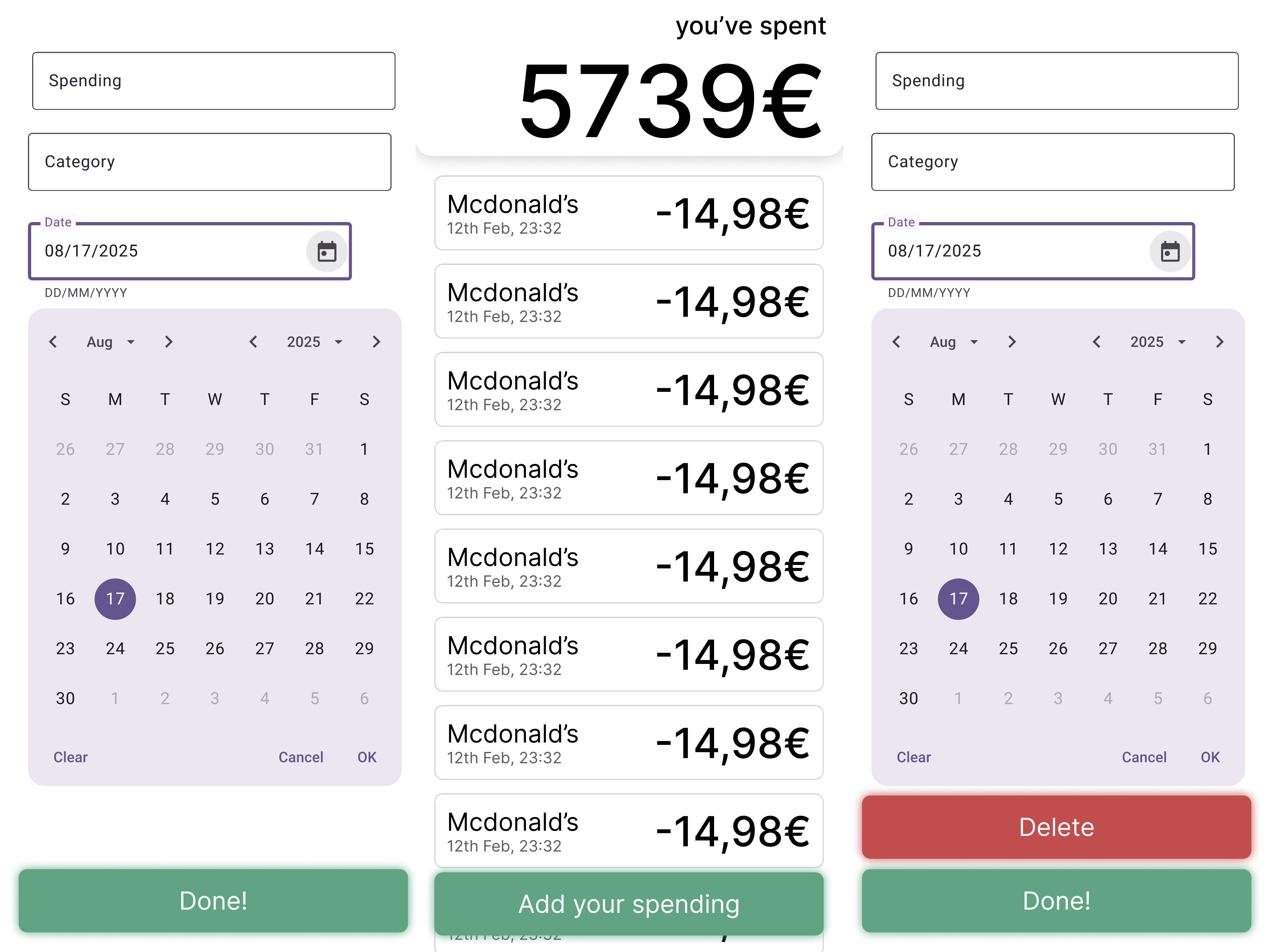
Ledger is a personal finance management app that enables users to log and track their income and expenses. Users can create entries by specifying the transaction type (income or expense), amount, category (e.g., groceries, salary, entertainment), and date. The app includes a summary screen for a quick overview of finances and a detailed transaction list for reviewing all logged entries. Users can edit or delete entries as needed, ensuring accurate record-keeping. FinanceFlow helps users stay on top of their budget with a clear and organized interface.
The Team
Xaver Drabik & Florian Kraushofer
App Concept
Use Case
Primary Use Case:
- Tracking and Managing Personal Finances
- Viewing Financial Summaries
- Logging Transactions
- Organizing Finances by Categories
- Financial Planning
- Monitoring Budgets
Target Users
People who want a simple and effective way to manage their personal finances. People who want to stay organized by tracking their income and expenses, categorizing transactions, and gaining insights into their financial habits.
Like:
- Freelancers
- Students
- Budget-Conscious Individuals
- Small Business Owners
Mockups
Database
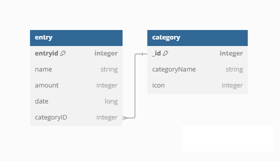
The database structure consists of two tables: entry and category. The entry table stores individual records with fields like entryid (primary key), name, amount, date, and categoryID (foreign key), while the category table stores categories with fields like _id (primary key), categoryName, and icon. The categoryID in the entry table is designed to link entries to specific categories, enabling categorization and organization of data. This structure ensures efficient data management and retrieval based on categorized relationships.
Usability Testing Plan
Experimental Questions & Variables
-
Question: Did you find the app easy to use?
- IV: App navigation design (e.g., layout, menu structure, or usability features).
- DV: User-reported issues or difficulties while navigating.
- Methods: SEQ Question
-
Question: Does the user find Categories useful?
- IV: Presence or design of the Categories feature.
- DV: User perception of usefulness (e.g., measured via survey or rating).
- Method: Likert scale How useful was it?
-
Question: Does the user find Categories?
- IV: Visibility or accessibility of the Categories feature.
- DV: User success in locating or using Categories.
- Method: Task Completion Testing
-
Question: Does the icon selection affect user satisfaction?
- IV: Icon design or selection (e.g., different icon styles or clarity).
- DV: User satisfaction (e.g., measured via survey or rating).
- Method: Open Question
-
Question: How long does it take for a user to add a Category?
- IV: Process or interface for adding a Category (e.g., number of steps, clarity of instructions).
- DV: Time taken to complete the task.
- Method: Time till completion
-
Question: How long does it take for a user to add a Transaction?
- IV: Process or interface for adding a Transaction (e.g., simplicity, number of fields).
- DV: Time taken to complete the task.
- Method: Time till completion
Heuristic Evaluation
Based off of Nielsen’s 10 Heuristics. Done by both team members based on the Mockup. Results were implemented in the android application.
-
Visibility of System Status
- Issue: Users may not be immediately aware of changes to their balance after adding or editing a transaction, as there is no clear feedback.
- Recommendations: Implement a visual or auditory feedback system (e.g., a confirmation message or animation or redirect to the Balance overview) to inform users when their balance updates.
-
Match Between System and the Real World
- Issues: None
- Recommendations: None
-
User Control and Freedom
- Issues: Users might want to create their own categories rather than use the predefined ones.
- Recommendations: Introduce a feature to add and delete your own categories.
-
Consistency and Standards
- Issues: The "Your Balance" and the name of the transaction do not share the same font
- Recommendations: Standardize all texts to use the same font, and color scheme for a cohesive user experience.
-
Error Prevention
- Issues: Users might enter invalid data, such as symbols as the amount, without receiving a warning, leading to potential errors.
- Recommendations: Add validation checks and warnings to prevent users from entering incorrect data, ensuring errors are caught before submission.
-
Recognition Rather Than Recall
- Issues: Users may need to remember details about past transactions, such as categories or dates, which could increase cognitive load.
- Recommendations: Display a detailed transaction history with categories and dates visible at all times, reducing the need for users to recall information.
-
Flexibility and Efficiency of Use
- Issues: Users may find it time-consuming to navigate through multiple screens or steps to perform common tasks, such as adding or editing transactions.
- Recommendations: Ensure that all frequently used actions, like adding or deleting transactions, can be completed in as few steps as possible, with clear and accessible buttons for quick access.
-
Aesthetic and Minimalist Design
- Issues: The interface might include too many visual elements or colors, which could distract users from focusing on their primary tasks, such as managing transactions or checking their balance.
- Recommendations: Ensure that the design remains clean and focused by using a limited color palette and removing any unnecessary decorative elements, keeping the interface visually simple and task-oriented.
-
Help Users Recognize, Diagnose, and Recover from Errors
- Issues: Error messages may not clearly explain what went wrong or how to fix it, leaving users confused.
- Recommendations: Provide detailed error messages in plain language, including actionable steps to resolve the issue.
-
Help and Documentation
- Issues: Help and Documentation may be important and nice to have but out of scope for this version of the design.
- Recommendations: For now, focus on maintaining the clarity and simplicity of the current help documentation. If these advanced features are considered in future updates, ensure that corresponding help resources are developed to support them.
Results
Participant Demographics
- Number of Test Subjects: 5
- Demographics: University Students aged 19-23
Quantitative Evaluation
Task Completion Time
Adding a Category:
| Participant | Time (seconds) |
|---|---|
| 1 | 18 |
| 2 | 69 |
| 3 | 40 |
| 4 | 18 |
| 5 | 15 |
Average Time: 32 seconds
Adding a Transaction:
| Participant | Time (seconds) |
|---|---|
| 1 | 18 |
| 2 | 11 |
| 3 | 60 |
| 4 | 43 |
| 5 | 30 |
Average Time: 32.4 seconds
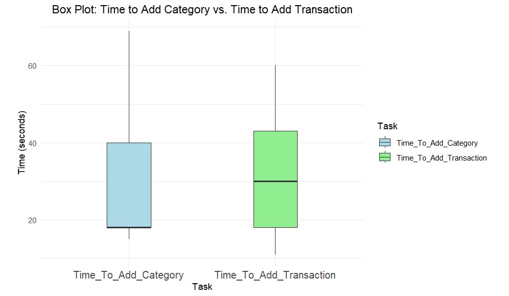
Time to Add Category vs. Time to Add Transaction:
- The box plot shows variability in task completion times, with some participants taking significantly longer than others.
- For adding a category, Participant 2 took 69 seconds, which is an outlier compared to the others (15–40 seconds).
- For adding a transaction, Participant 3 took 60 seconds, while others completed the task in 11–43 seconds.
- This variability suggests that some users may have struggled with the interface or navigation, particularly for adding categories.
User Satisfaction Scores
Ease of Use (Scale: 1-7):
| Participant | Score |
|---|---|
| 1 | 7 |
| 2 | 5 |
| 3 | 7 |
| 4 | 7 |
| 5 | 6 |
Average Score: 6.4
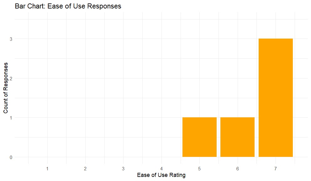
Ease of use:
- The bar chart shows that most participants rated the app highly for ease of use, with four out of five giving scores of 6 or higher.
- Participant 2 gave a lower score of 5, which aligns with their feedback about difficulty finding categories and longer task completion times.
- The chart reinforces the overall positive perception of the app's usability but highlights the need to address specific pain points for users like Participant 2.
Finding Categories and their Usefulness
Usefulness of Categories (Scale: 1-5) & Found Categories (Scale: Yes/No):
| Participant | Score | Found |
|---|---|---|
| 1 | 3 | Yes |
| 2 | 4 | No |
| 3 | 4 | Yes |
| 4 | 5 | Yes |
| 5 | 5 | Yes |
Average Score: 4.2
Task Success Rate
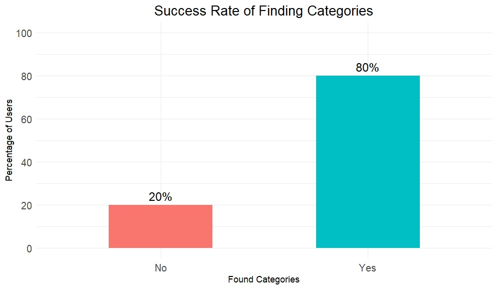
Finding Categories:
- The bar chart visually confirms that the majority of participants (80%) successfully found the categories.
- However, 1 participant who struggled is representing areas for improvement.
Usefulness of Categories vs. Found Categories
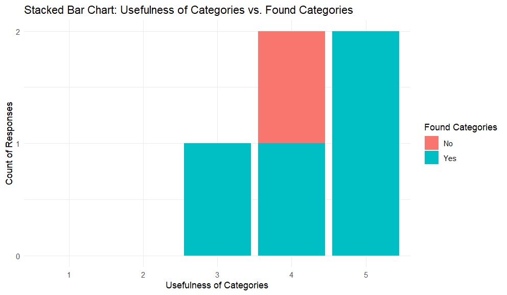
Usefulness of Categories vs. Found Categories:
- The stacked bar chart shows a strong correlation between finding categories and perceiving them as useful.
- Four out of five participants found the categories and rated their usefulness highly (scores of 4 or 5).
- Participant 2, who did not find the categories initially, still rated their usefulness as 4, suggesting that they recognized the potential value once they located them.
- The chart highlights the importance of making categories easy to find, as discoverability directly impacts perceived usefulness.
Qualitative Feedback
Positive Feedback:
- "The app is easy to use."
- "Categories are useful for organizing transactions."
Negative Feedback:
- "I could not find the categories initially."
- "The icon selection is missing a Pets category."
Suggestions for Improvement:
- "Add a Pet Icon.”
- "Improve the visibility of categories in the app."
Updates Made to the App
Based on the feedback and insights from the charts, the following updates were made:
-
Improved Visibility of System Status:
- Added headings for Category and Transaction screens to make navigation more intuitive.
-
Improved Category Visibility:
- Redesigned the categories section to make it more prominent and easier to find, addressing the issue raised by Participant 2.
Reflection
Xaver Drabik
I really enjoyed working with Florian on this project. Combining our strengths helped us create a functional and user-friendly app. Usability testing was particularly rewarding, offering insights into UI/UX design I wouldn’t have considered otherwise. Watching real users interact with the app revealed areas for improvement I might have missed. This experience deepened my appreciation for user-centered design and the importance of testing in creating a polished product.